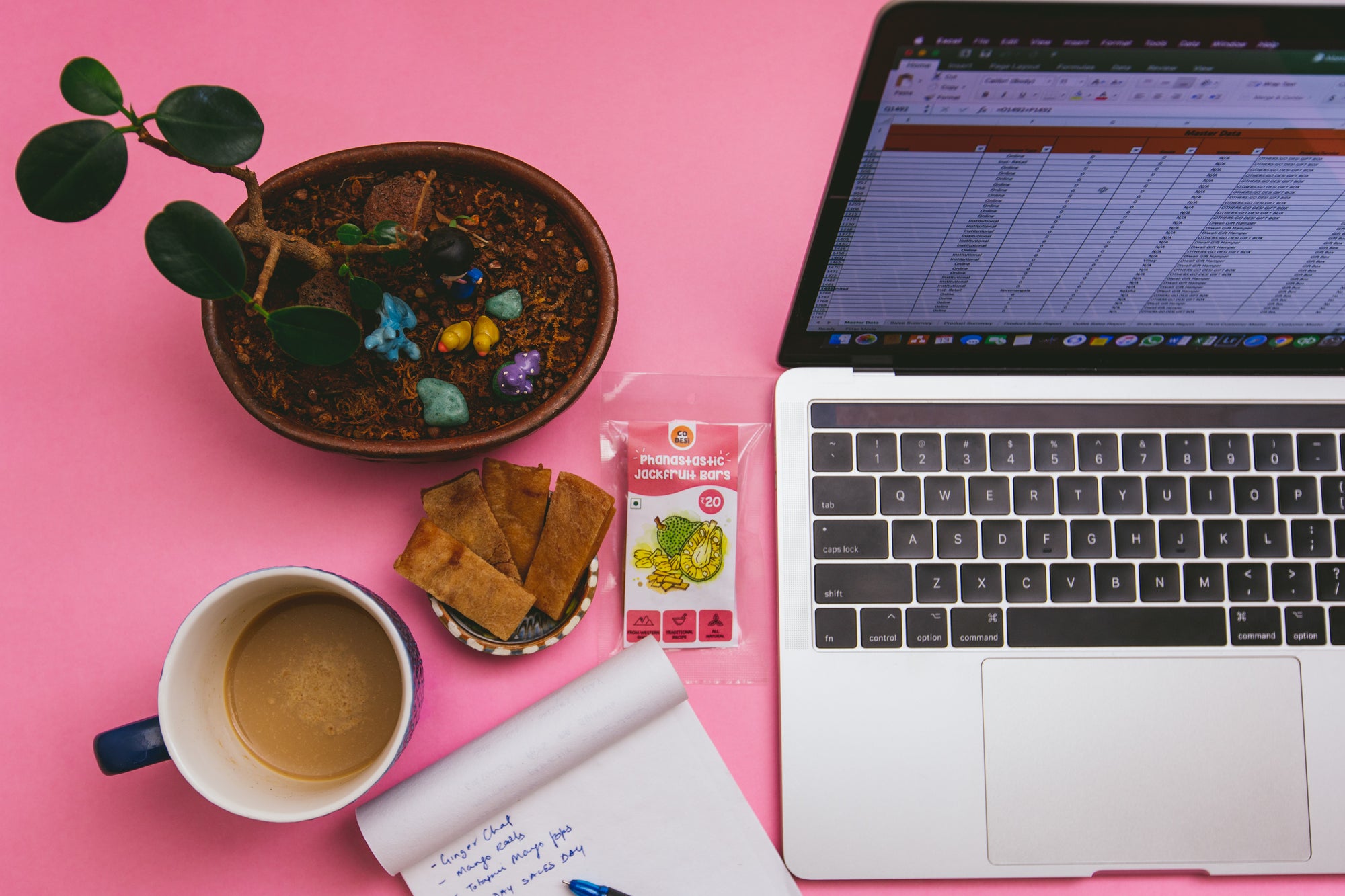
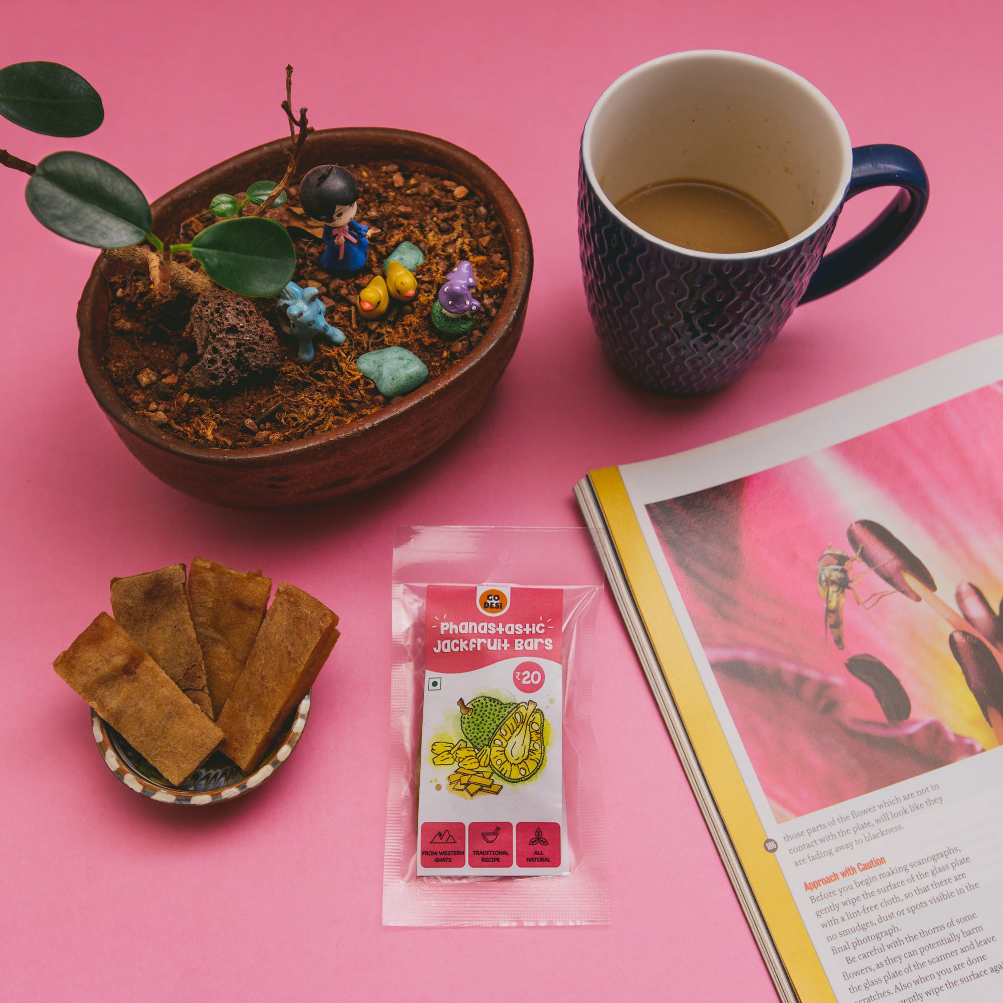
At GO DESi, we bring regional, tradition, 'as is' food/ confectionery products predominantly hand made in rural microenterprises to urban markets. The very nature of the products meant that the products were not identical, looked rustic and by packaged food brands standard which lines the supermarket shelves not "shelf ready". A term we got to hear many times in our little one year journey.

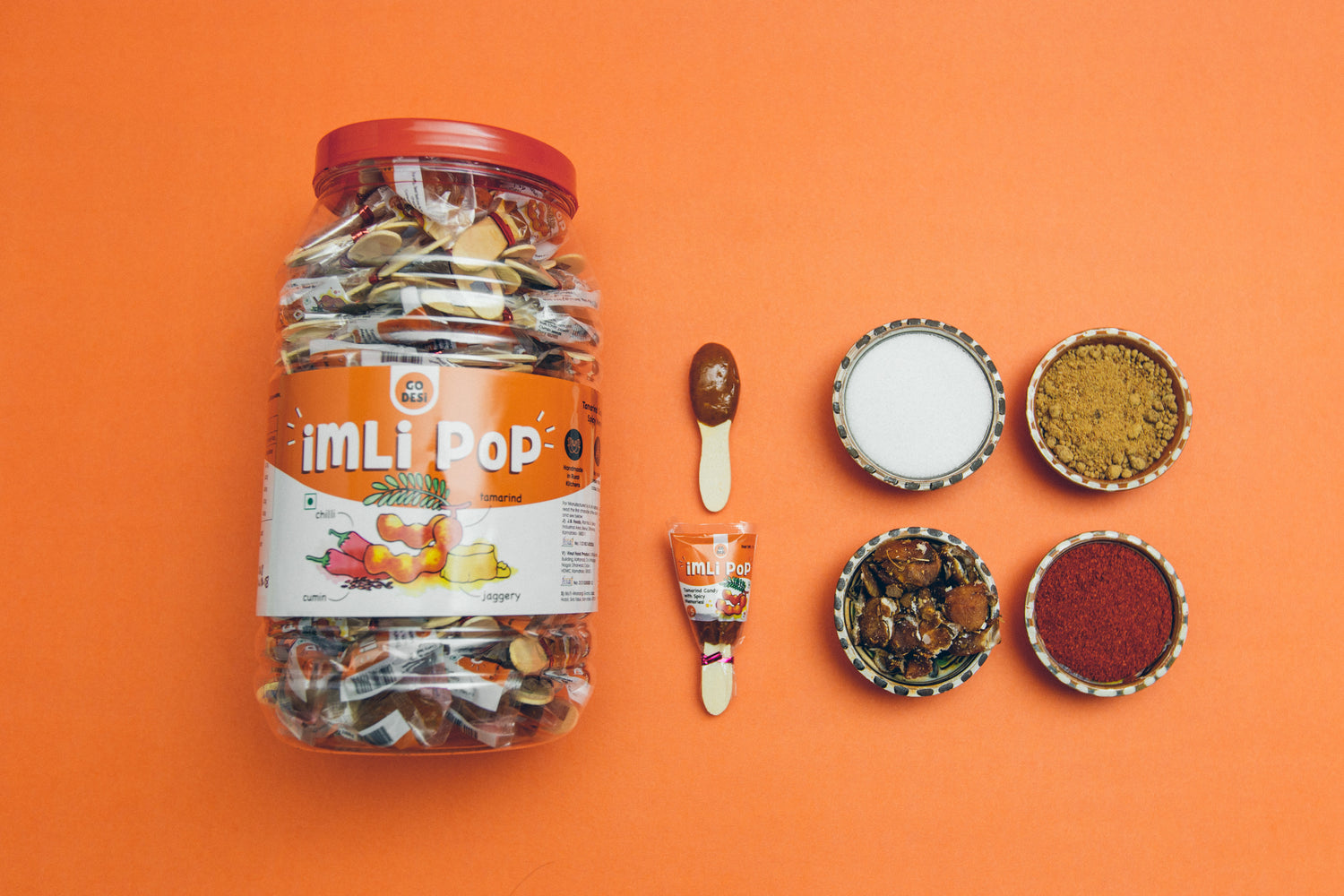
This post is all about how we went about making GO DESi products shelf ready without losing our essence using Imli pops as an example. We wanted to start at a position of strength and hence listed down what are the key things which are working for us i.e. why are consumers buying Imli pop today?
- You get what you see- no surprises: The original product is not hidden behind a metalised laminate. If you look at any tapri, thela gaadi selling regional snacks, everything is transparent. My hypothesis is that if your ingredients are fresh and natural they have an innate appeal and hence there is no need to hide them behind shiny packaging.
- I know this product, I have memories of eating something like this before: We had to make sure that we exacerbate this feeling, not kill it in process of modernising the packaging.
-
Organic, natural products are not identical because that is how nature intended it to be. Going organic trend has done a good job to educate the early adopters what to expect when you say something is organics, natural, handmade; very similar to the khadi trend in the apparel industry. The challenge was how do you highlight this 'no two alike' feature as a virtue.

Our packaging had to preserve our strengths and at the same time conform to basic industry standards. We followed a very iterative process and our packaging has evolved over a period of one year taking into account consumer & customer feedback and also resources at our disposal. Some of the tools/ tricks that we used during this process.
- We used Simon Sinek's golden circle model & brand archetype to communicate to external partners on what we stand for so as to help them translate our essence visually.
- First designs were done on Canva, this tool is a life saver for non-designers who do not have photoshop skills to create somewhat appealing visual graphics.
- Bizongo, packingsupply.in & upack.in & city market (Bangalore) for buying off the shelf packaging. We iterated on the design to create differentiation rather than investing on die/ mould which is big long-term investments and go against our belief of "affordable losses"
- Working with offset/ digital printers which are more suitable for smaller volumes and easier to iterate with.
- One SKU at a time, we changed packaging design for one SKU, got real-time feedback, and then proceeded with other SKU's and variants. (Can't imagine this being done in a big consumer goods company).
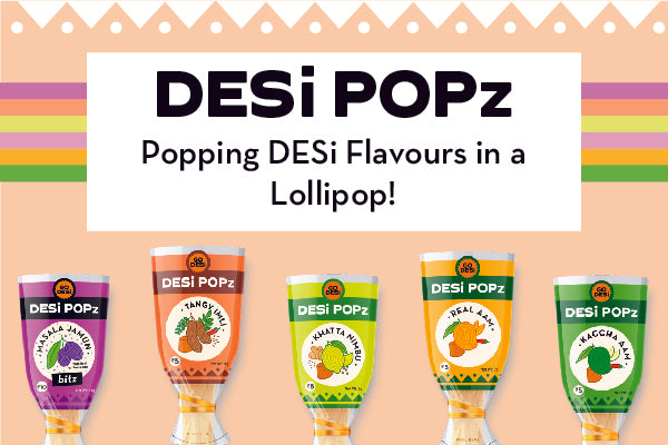
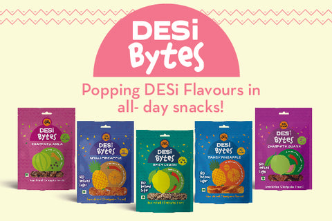
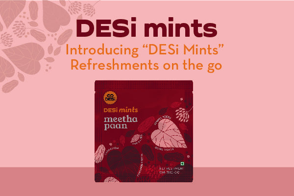
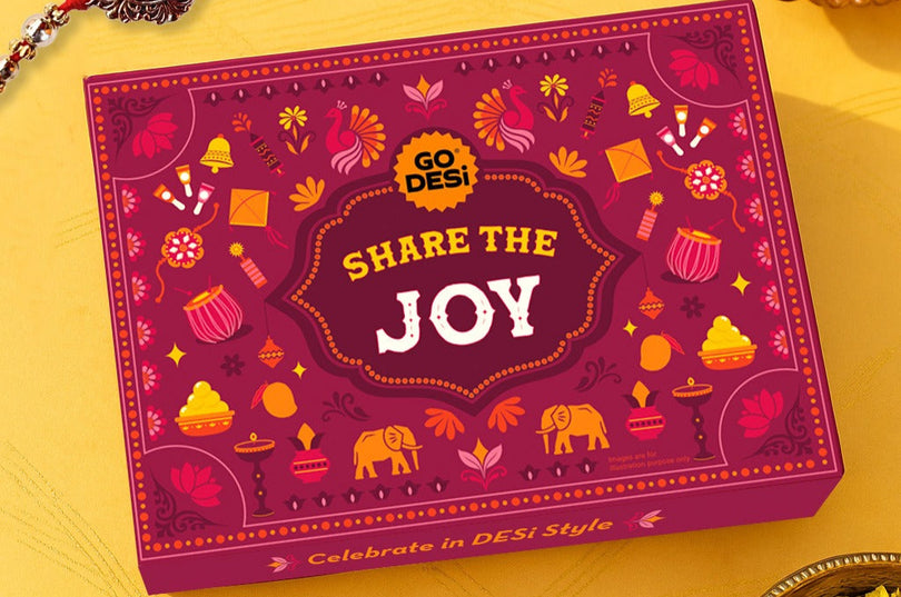
Will not go into how we incorporated our insights and what we wanted the consumer to take away from the packaging as it will defeat the purpose of packaging. I will let the images do the talking :)
Want to know more about Imli pop, read our post on Tamarind Love.

